Back to Black: Sharper, Clearer, Darker
Black is black, right?
No. Look out for body text made up of all four process colours. Instead of solid black, it’s made up of a mix of tints. It often happens when text is created using RGB based colour spaces
How did that happen?
Instead of 100% black linework, text is output using a combination of black, cyan, magenta and yellow.

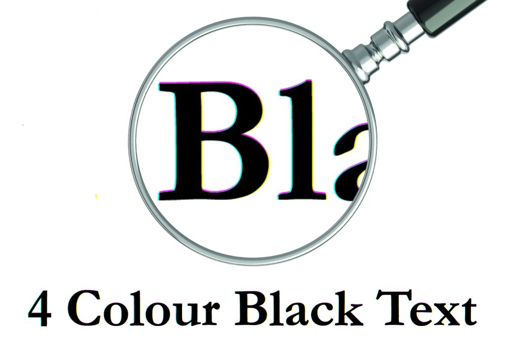
4 colour black text shows ‘fringing’ in cyan, magenta and yellow under a magnifier – it’s not pretty
Swatch out: Creating text using RGB swatches is the primary cause. Even in established industry apps such as InDesign™, we regularly see documents which have mistakenly defaulted to web or mobile output settings.
But I often use rich blacks in headlines: Yes, this is different. We’re talking body text. Using more than one process colour to build small black text can result in text that appears heavier and/or softer than intended. Normal, slight variations in registration of the 4 colours on press can cause other colours to show around the edges of the text that was intended to appear as black.
OK, get rid of it for me then:
Happily, it’s really not that difficult. Two steps and you’re there:


check your output intent in InDesign is set to “print”
-
Make sure your document colour space (or output intent) is CMYK. If your doc is made for web or mobile, you need to change it to print.
- Check your colour selector / swatches and change the colour to 100% process black.
