It’s that Golden time of the year….
It may be a little late to be designing your Christmas collateral, but it’s certainly that time of year where gold makes a bigger splash than any other time of year. The question is, how can you achieve that ‘sparkly’ effect without blowing your budget?
What is it with Gold?
Gold is one of the most sought-after finishes in print design because it conveys luxury, elegance, and sophistication. However, achieving a realistic gold effect with CMYK printing can be challenging since metallic inks aren’t part of the standard CMYK colour gamut. The good news? With the right techniques, you can create artwork that mimics gold with more pizzazz.
Why can’t CMYK Reproduce Real Metallic Gold?
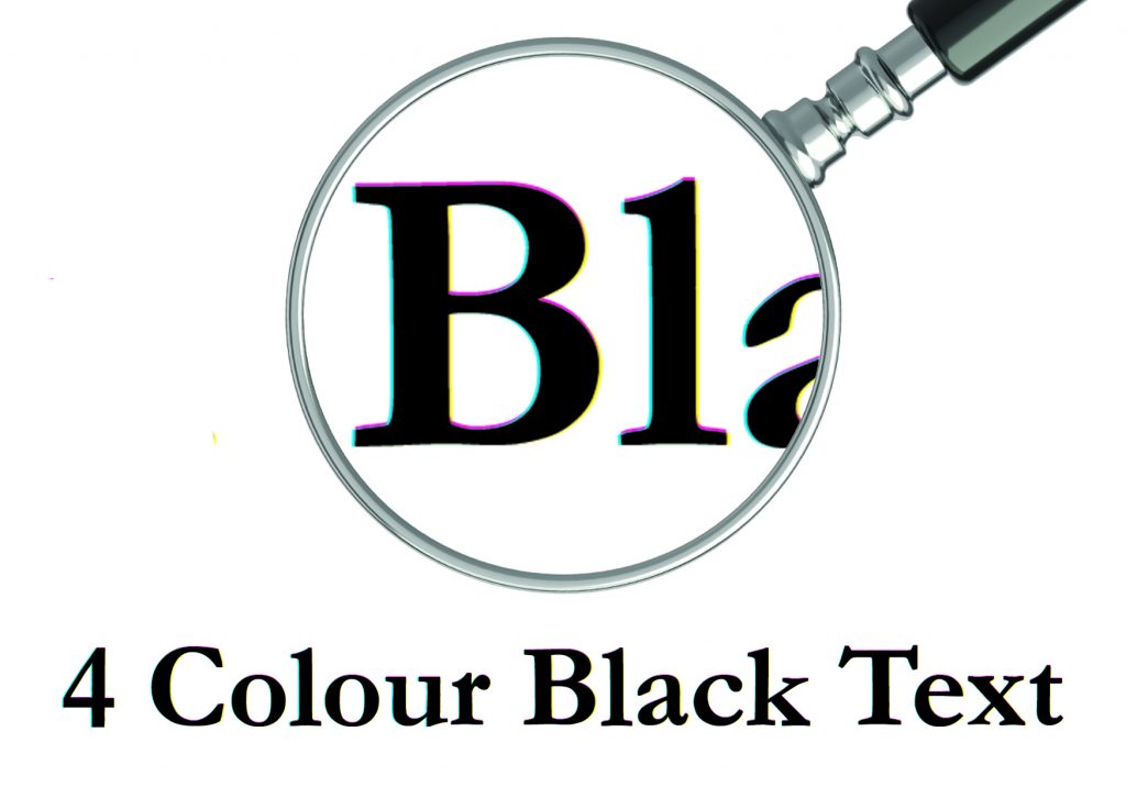
CMYK (Cyan, Magenta, Yellow, Black) inks are translucent and rely on colour mixing to produce shades. Metallic inks, on the other hand, contain reflective particles that give them their shine and are generally not mixed with other colours, relying on a simple 100% solid. CMYK lacks these particles so we need to ‘cheat’ a little and simulate the look of gold using colour, gradients, and texture.
Level 1: Choose the Right Gold Colour Values
Start with a strong base colour that resembles gold. Here are some popular CMYK values:
Rich Gold:
C: 0 | M: 20 | Y: 60 | K: 20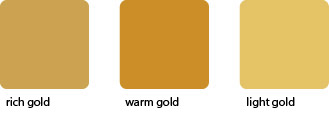
Warm Gold:
C: 0 | M: 30 | Y: 80 | K: 20
Light Gold:
C: 0 | M: 15 | Y: 55 | K: 10
Tip: Avoid pure yellow—it looks flat and lacks depth.
Level 2: Add Depth with Gradients
Gold isn’t a flat colour; it has highlights and shadows. Use linear or radial gradients to create contrast:
Light tones for highlights (near yellow)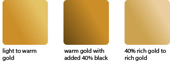
Darker tones for shadows (brownish or warm grey)
This gives the illusion of metallic shine.
Level 3: Incorporate Texture
Textures like brushed metal or subtle noise can make your gold effect more realistic. You can:
Overlay a metallic texture image in your design software.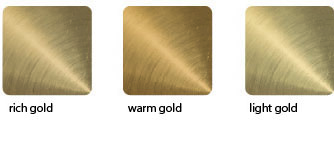
Use blending modes like Multiply or Overlay for a natural look.
Level 4: Simulate Shine
Add white highlights or thin reflective streaks to mimic light hitting the surface. This works well for text, logos, and decorative elements.
Level 5: Consider Spot Colours or Foil for True Metallic
If your client wants real metallic gold, CMYK alone won’t cut it. Recommend:
Pantone Metallic inks for offset printing.
Foil stamping for premium finishes.
Pro Tips for Print-Ready Artwork
Always design in CMYK mode (not RGB).
Use high-resolution textures (300 dpi).
Check with your printer for colour profiles and proofing options.
Final Thoughts
Creating a gold effect in CMYK is all about illusion—using colour, gradients, and texture to trick the eye. While it won’t be truly metallic, these techniques can deliver a luxurious look that impresses your clients.


 In general, this would be problematic, due to the petroleum base of most plastics. However, less harmful options are becoming available, such as laminates made from soy polymers, which are manufactured from soybean proteins. (Keep in mind, however, that although soy polymers are biodegradable, they do require land and water for growing the crops from which they are made. In addition, carbon dioxide, which contributes to global warming, is released during their manufacture. Soy polymers are also expensive. So while they are better for the environment than petroleum based materials, they are not without their problems.)