tick the [trim] box

tick the [trim] box

When we go through the imposition stage, we position each page on the plate to an accuracy of microns in precisely the right position so that when a flat sheet is folded down, your images will appear in the right postion.

How do we know where the edge of your pages are? Well, you probably use corner marks, or ‘tick’ marks as the print trade calls them, but beware – these are not the first port of call for page laydown software in the studio.

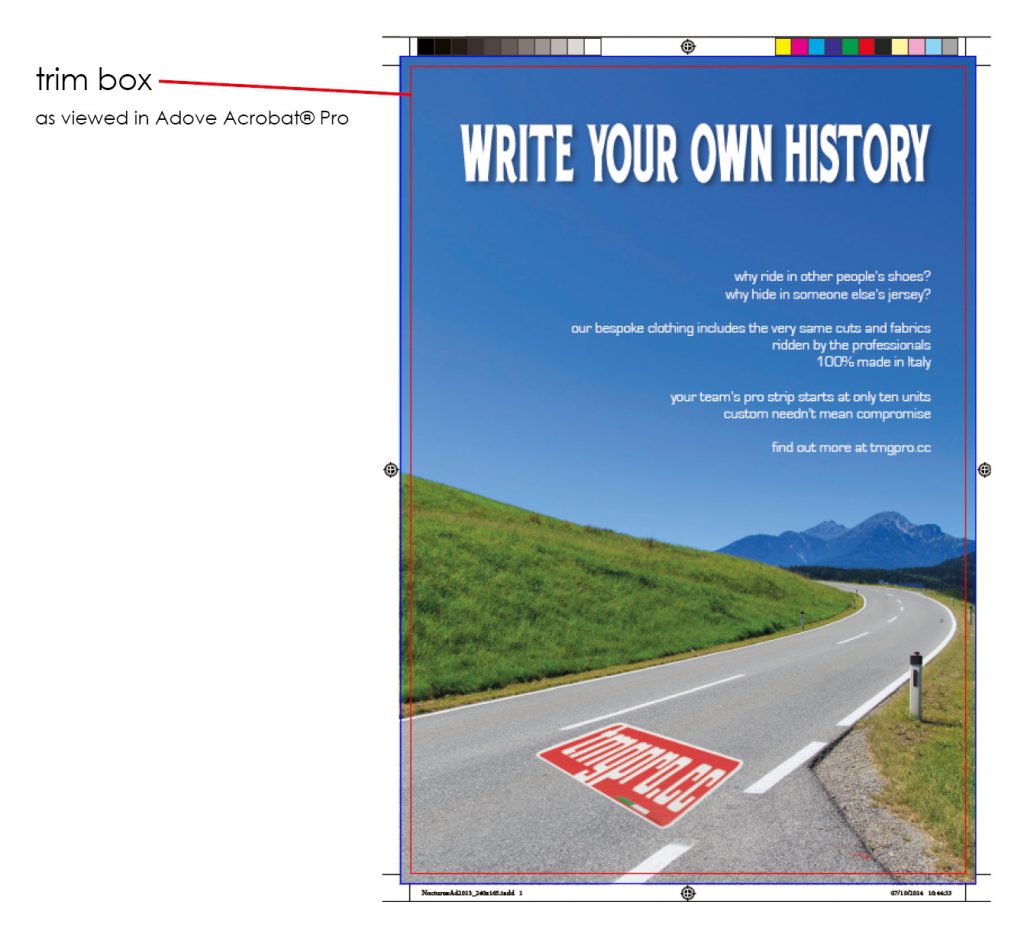
When you create a page in InDesign, the page dimension you specify in document setup creates a trim box which carries through to the press ready PDF file you’ll ultimately create and it’s what all page laydown systems refer to for positioning.

Why create a trim box? Years ago, imposition systems would position using X-Y coordinates from the edge of the document; literally the white space or what’s known alternatively as the Media Box. Most editorial applications would position trim 10mm from the Media Box symmetrically on every edge, but a multitude of originators (particularly advertising agencies) would often add extra space around the edge, creating more white space, sometimes asymmetrical, which caused mispositioning.

The presence of a trim box guarantees that the page will fall into the correct position irrespective of peripheral elements. Likewise, the absence of a trim box will throw a spanner in the works, so to speak. Broadly speaking, absent trim boxes fall into two categories – 1. the global setting and 2.the isolated pages.

1. tends to occur where pages are created in less ‘robust’ applications like Microsoft Publisher or where pages are saved as PDF directly from non-page layout applications. These tend to be spotted quickly because every page is out of position to the same degree and, in cases where it’s practical to do so, we can alter global settings at our end to correct the problem.

2. isolated pages are where the problem becomes more dangerous. They occur most frequently in magazines where ad copy is not processed through the main layout document and pages are supplied to us as exactly the same PDF file the advertiser supplied to the publisher. They can be more difficult to identify, lying as they do, in between correct pages.

It’s always safest to run your ad pages through your main layout document. That way, you’ll spot any discrepancies in the page geometry before it reaches us, avoiding possible extra costs and delay. It also gives you the opportunity to go back to your advertiser with constructive feedback at an early stage.

How do you check for trim boxes? Easy. Open your file in Acrobat Pro, go to Edit>Preferences>Page Display. Check ‘Show art, trim & bleed boxes’ then ‘OK’. You’ll now get a red hairline which won’t print to show the trim box on every PDF file you open.

trimboxdiagram


TAC (Total Area Coverage)

TAC (Total Area Coverage)

When we use the term ‘saturation’, it’s often used as a way of describing colour areas which are too heavy. In fact, over-coloured areas can quite literally lead to saturated paper which in turn can cause problems with set off and accuracy of reproduction.

The ability of paper to accept heavy weights of ink is tightly calculated and managed. This is where the idea of TAC comes in. TAC refers to the Total Area Coverage of the 4 process colours on a printed sheet. For example, a bright red made up of 100% Y and 100% M would be 200% TAC. Fine. The colour ‘registration’ is 100% of all 4 colours so 400% TAC. Nightmare. Impossible to print at standard ink weights.

Our TAC is 280%. If your halftone images exceed this, our software may ‘open out’ the darker areas slightly using a subtle curve to limit the potential problems of over-saturation. In general, we will not alter ‘graphic’ content such as logos, text and boxes, so you will need to consider this if you are matching graphic content to pictures.

Acrobat Professional can check for TAC. Go to Advanced> Print Production> Output Preview. Set your TAC limit near the foot of the box and switch on so that your overweight areas are highlighted. You can even select your preferred warning colour.

screenshot-2014-10-07-20-21-35

It’s far better if you manage your content so that it’s below our limits when you upload. That way, we don’t have to tweak anything and your screen image is more realistic. In general though, you’ll find that the ‘opening out’ process involves UCR, or the conversion of C, Y and M to K only, so the colour hues should not change.